
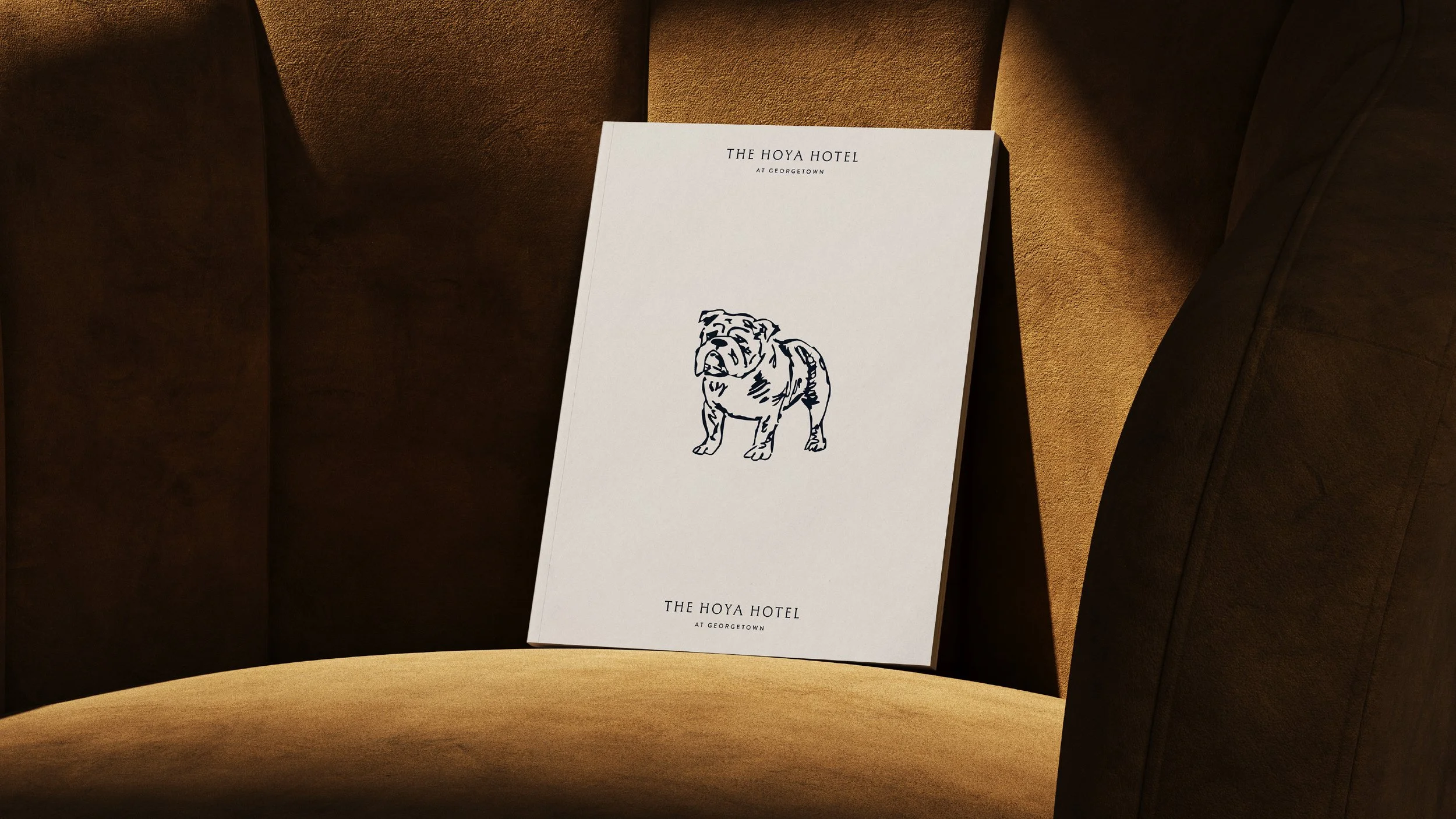
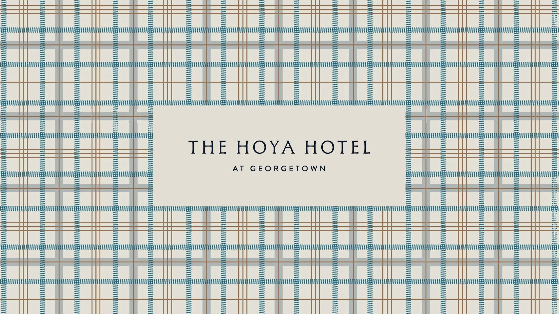
The Hoya Hotel
“Hoya” is the nickname and rallying cry of Georgetown University, instantly recognizable. Using “Hoya” in the name directly ties the hotel to the university’s spirit and traditions, signaling a sense of belonging.

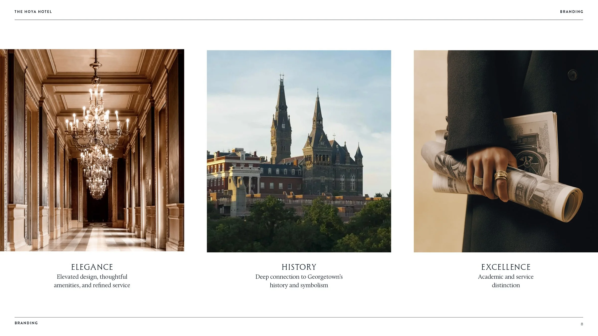
Four-diamond elegance
Georgetown centric
Excellence
Heritage & Tradition
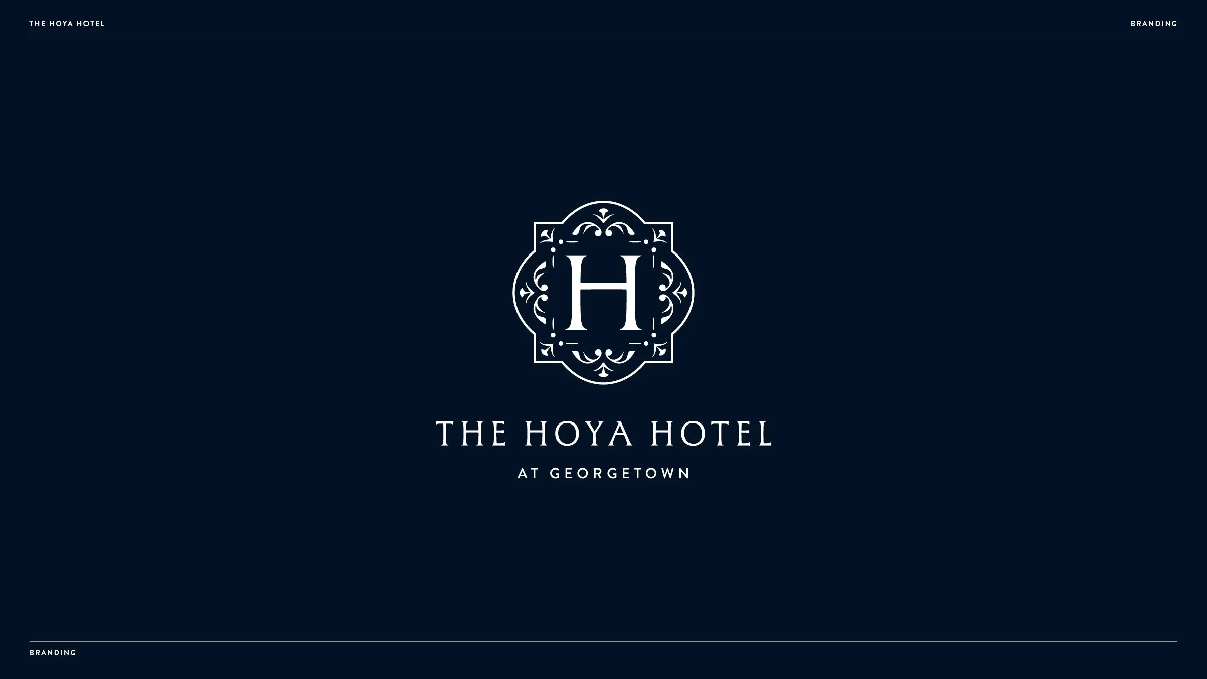
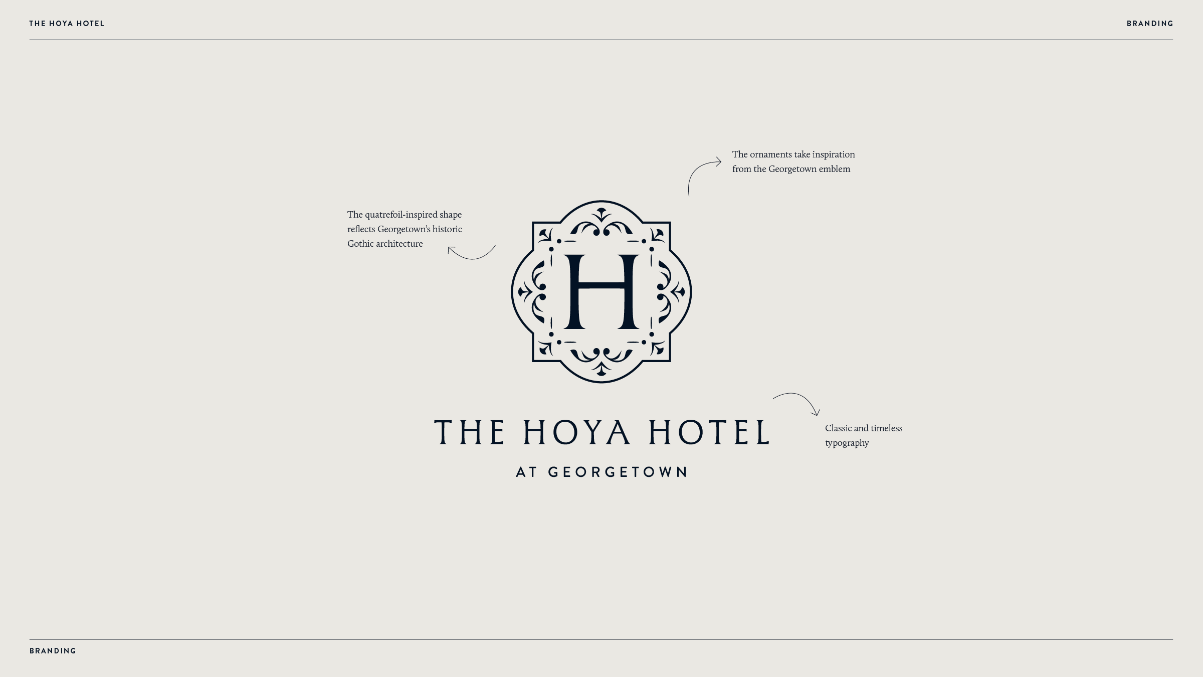
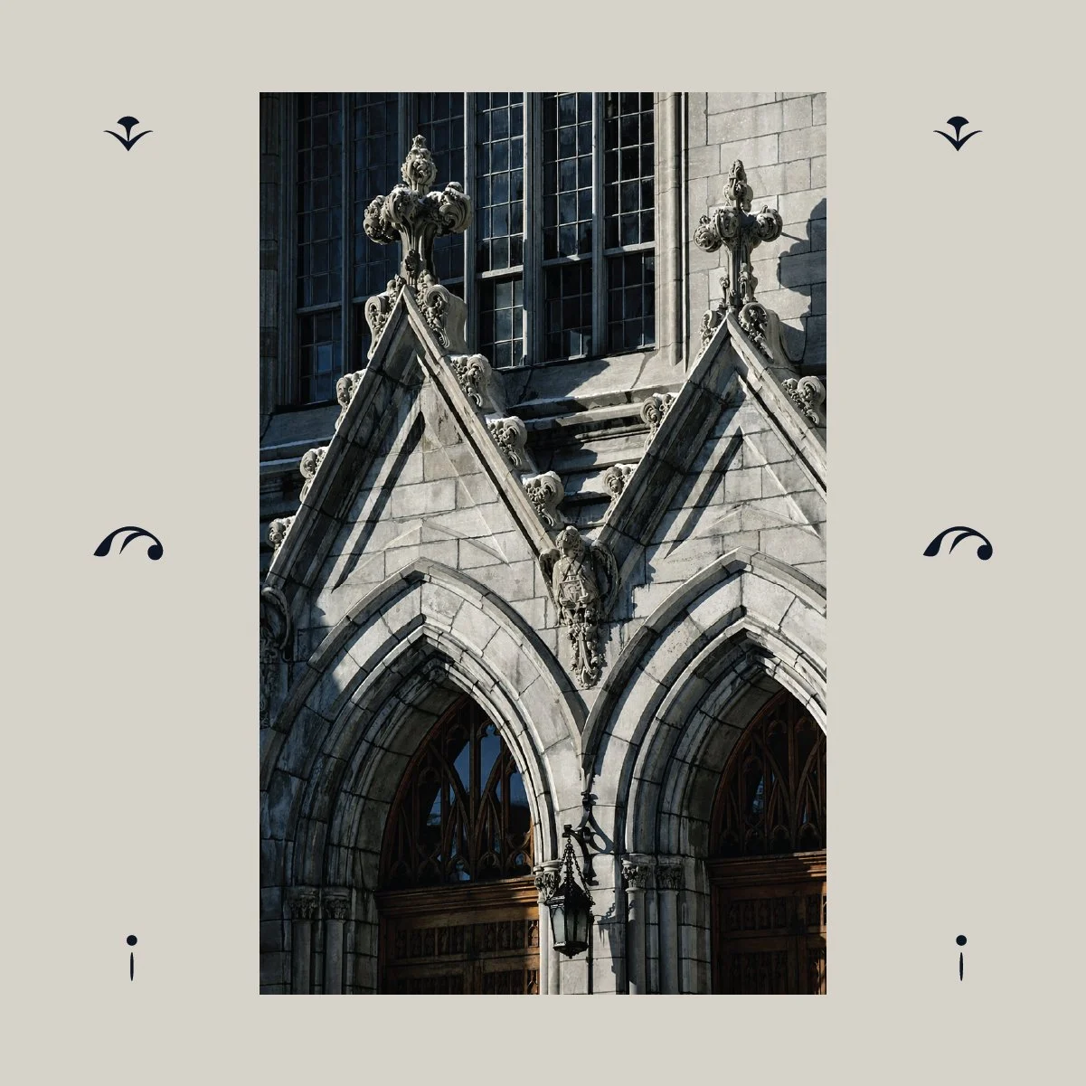
Inspired by the symbolism within Georgetown’s historic seal, the logo embodies a spirit of merit—a visual expression of excellence, tradition, and belonging. The emblem is detailed and distinctive, echoing the formal elegance of academic insignia while remaining modern in its restraint.
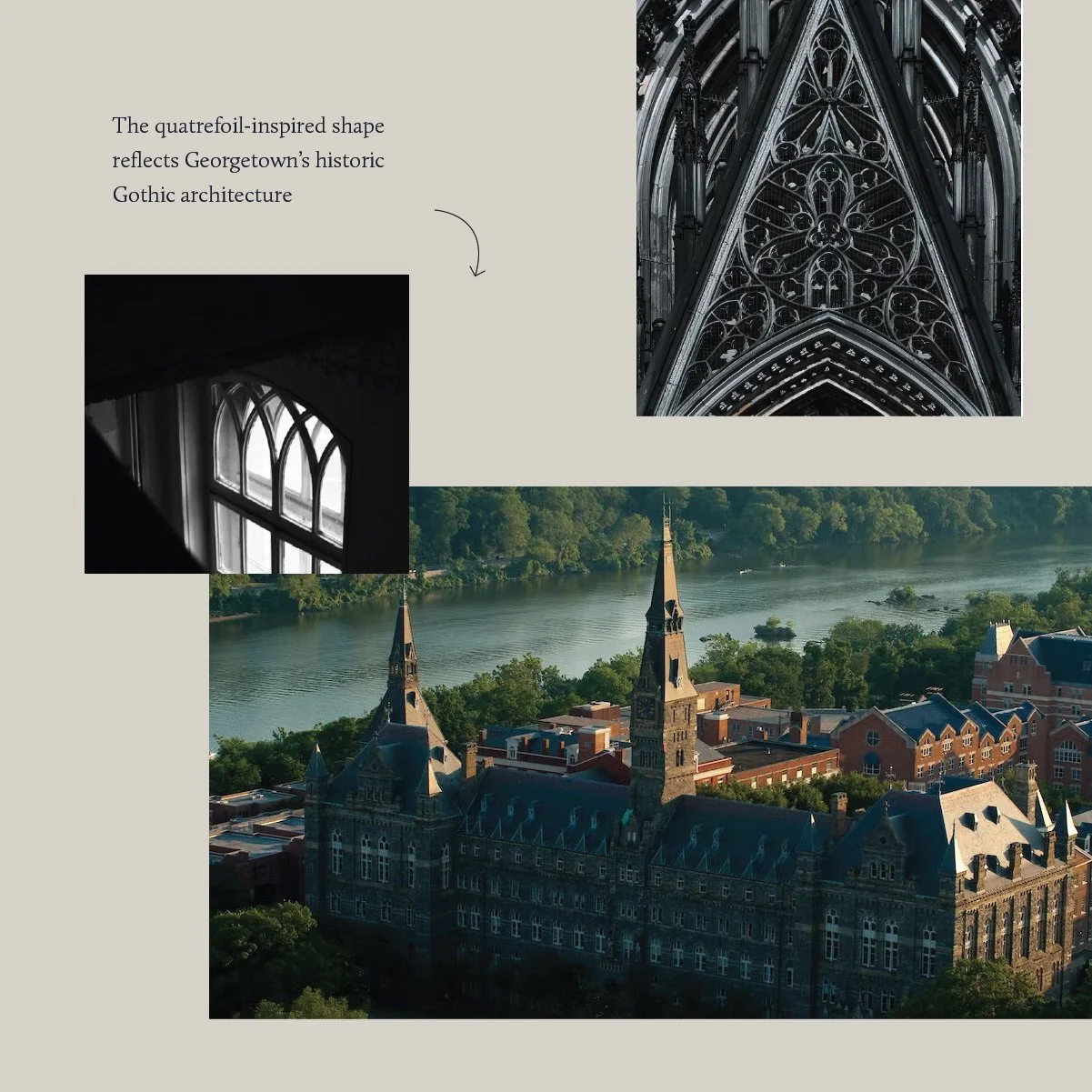
Each element is crafted as a refined homage to place and purpose, drawing from the university’s enduring history. The mark’s quatrefoil-inspired shape reflects the Gothic architecture found throughout Georgetown’s campus, subtly anchoring the design in its physical and cultural context.

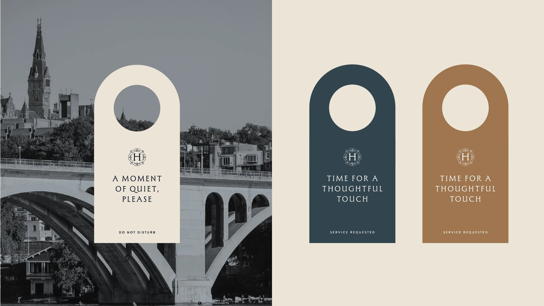
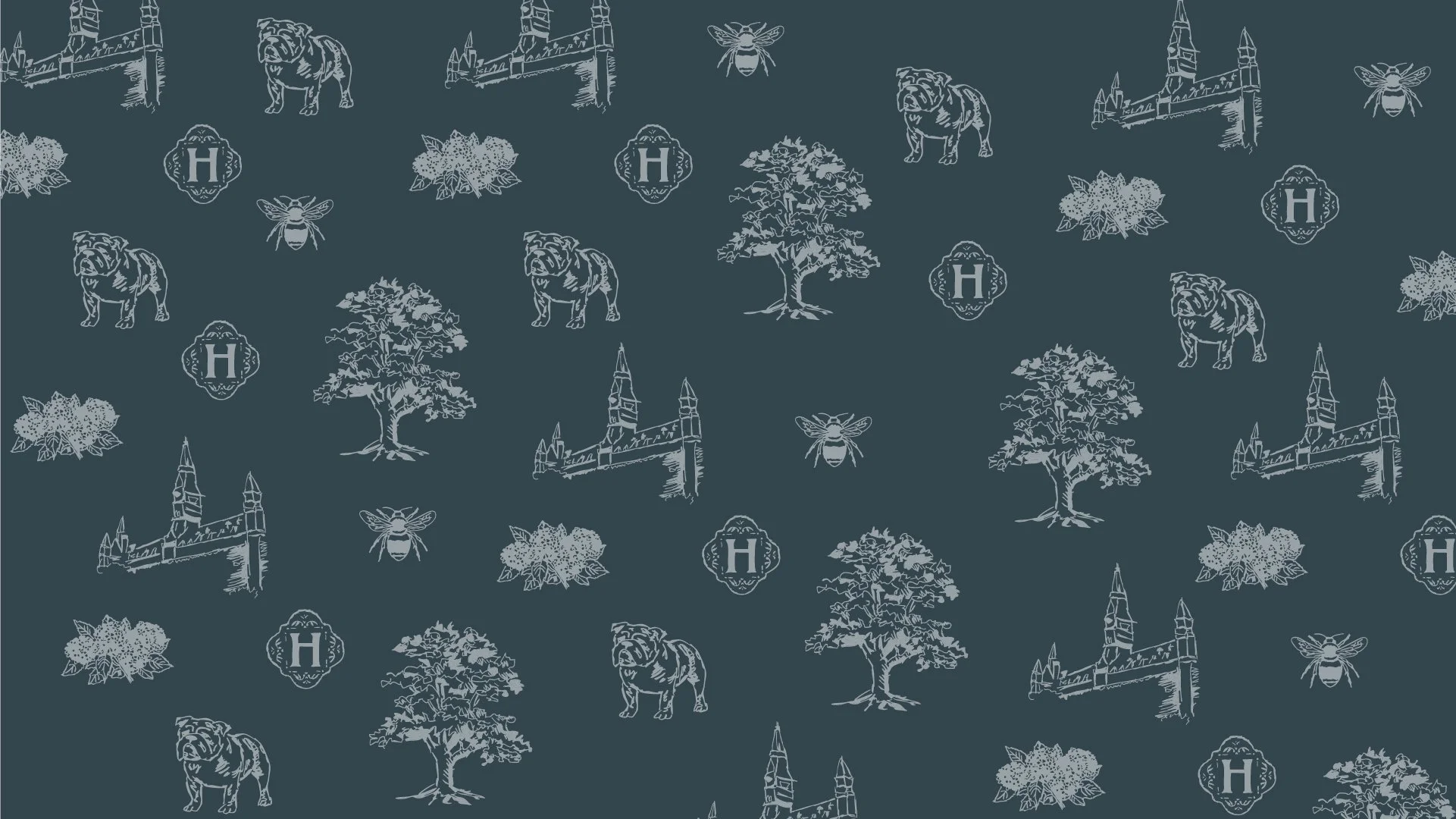
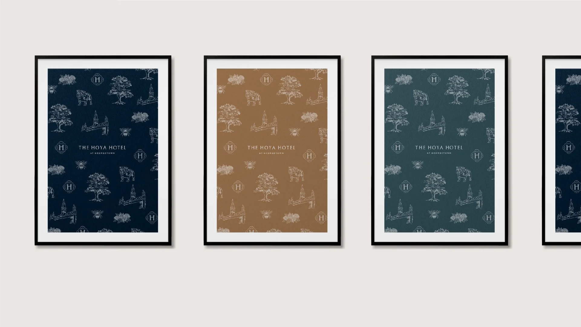


We have created a set of brand patterns and graphics to use across all communications. Featuring brand colors and iconic symbols, they are used to complement photography and typography.